The flow management tool can be accessed in the Portal Management module of the Settings section in the admin by the content-management role. After choosing the portal (if there is more than one), select "Flows" from the left-side menu in the CONTENT section.
A flow is a set sequence of various component-types that can be created, edited, and enabled at the portal level.
Included in this article:
- How to Create a Flow
- Page and Content Components
- Scheduling and Registration Components
- Quiz and Survey Components
How to create a flow
Click the "CREATE A NEW FLOW" button above the table and enter a name for the flow in the title text box (max characters is 50).
Flow Settings
You can enter the settings for the flow by clicking the "Start of Flow" tile in the flow-builder field (the right portion of the screen). Once clicked, the editor appears on the left:
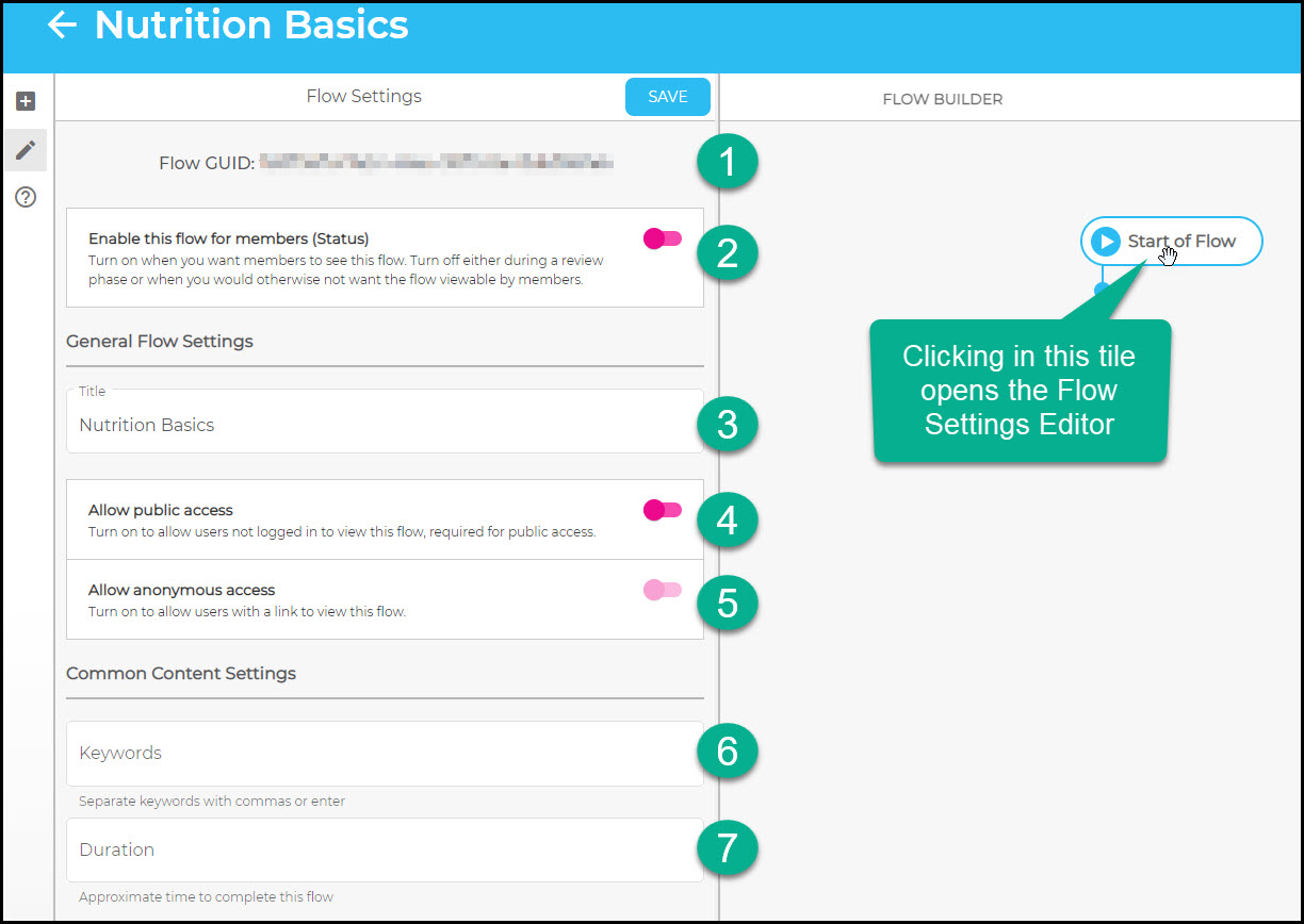
- The Flow GUID (this is the unique ID for the flow) is automatically generated when you create a new flow and is listed here.
- Enabling the flow (toggle to the right and green) makes it accessible to members of the portal.
- This is the flow title that will appear to members and in the flow table on the main admin flow page.
- When public access is allowed, the flow can be accessed by sharing the URL with someone; authentication is not required.
- If the flow has been set to allow public access, you have the option to allow anonymous access, which means that the flow can be accessed and filled out by any anonymous user who is given the URL.
- Enter any keywords associated with the flow. Keywords can help in grouping flows and searching by category.
- The duration is the estimation of how long the flow will take to complete.
Adding Flow Components
Beneath the "Start of Flow" tile, all the components you want to have in the flow can be assembled and sequenced.
You can compose the flow by dragging and dropping the components from the left side of the page into the flow-builder:
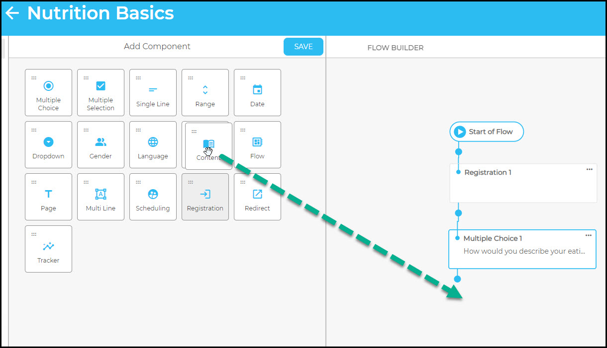
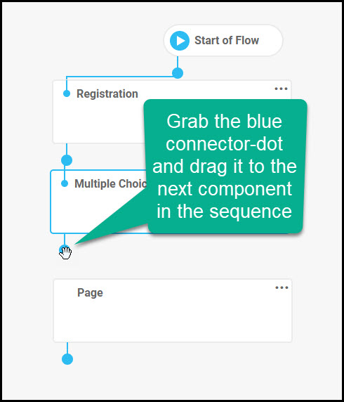
Connect each component in the sequence you want by dragging the blue-connector line from one component to the next:
Component Types
There are component types that allow you to do whatever you'd like inside a flow. Component types allow you to create any custom content, create various types of quizzes and surveys, gather member registration data, allow members to schedule appointments, and pull in content from the system and custom libraries.
Page Component
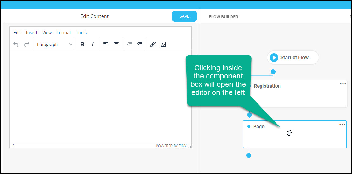
Pages are a message that can be appended to the beginning or the end of another question; this component is simply text that you enter into the WYSIGYG editor. Once a page component is dragged into the flow-builder, simply click inside of the box to open the editor:
Content Component
Content components include any video, audio, and article that is enabled in the content library for the portal. Once you drag the content component box into the flow-builder, click inside of it and all content available for the relevant portal will appear on the left. You can search for the content by typing key words and titles into the search field or by scrolling down through the list.
Note that there is the option to require video/audio content to be fully played through when it is reached in the flow. If this option is toggled on, the user cannot fast-forward through the content.
Registration Component
The registration component only exists for portals that have authentication set as standard login. For applicable portals, the registration component can be used to create an intake process for members. Clicking inside the Registration box after it's been dragged into the flow-builder opens the component's settings.
- Collect Contact Information: Enable this option (toggle to "on" position) if the member does not exist within the system—that is, collecting contact info is necessary for unknown users. When this setting is enabled, members will provide contact information (name/email/mobile number) when they access the flow. If the member already exists within the Engagement Rx system then this should be toggled to the "off" position—for example, if a known member is being sent an email or text through a coaching automation for data collection, this setting should be disabled.
- Portal Registration: This can only be enabled (toggled to "on" position) when the "Collect Contact Information" option is enabled; when both are enabled, the flow will collect a password from the member. Note: this is only applicable to portals that are using standard login.
Beneath these toggles are text fields that you can populate for both introduction text and waiver text.
Scheduling Component
The scheduling component allows members to schedule meetings and appointments as part of the flow.
Redirect Component
The redirect component allows the redirection from the flow to a specific destination outside of the flow. Once you drag and drop it into the builder field, click inside the tile and the list of options for the redirect endpoint appears in the left side of the screen:
- Member dashboard
- Tracker dashboard
- BMI calculator
- Calorie calculator
- Content library
- Goal reminder center
- Mobile app
- Personal journal
- Course catalog
- Course (when this option is selected, choose which course you are redirecting to from the list that appears to the right; all courses available in the portal are listed)
- URL (when this option is selected, you can enter the URL into the field that appears to the right of the option; you can also edit the default text that will be presented to the member when they reach this redirect component)
Language Selector Component
The language selector component enables the user to choose their preferred language from a dropdown list of 14 options:
- English
- French
- Spanish
- Hindi
- Arabic
- Chinese
- Gujarati
- Haitian
- Italian
- Korean
- Polish
- Portuguese
- Russian
- Tagalog
The flow author can enter the question (phrased in whatever way is desired), and can also, if needed, include a question header and help text.
Once a language is selected by the user in the flow, the web page language selection changes to the selected language and the member profile for the user is updated to match the selection.
Tracker Component
After entering the tracker component into the flow, choose which tracker you want to enter by selecting it from the drop-down menu which will list all trackers enabled for the flow. You can choose to create a question header for the tracker and, if wanted, you can require a response.
Quiz and Survey Components
- Multiple Choice—One choice will be selected by members. *, **
- Multiple Selection—Multiple choices can be selected by members. *, **
- Dropdown—Responses are displayed in a dropdown field from which members can select one answer.*, **
- Single-Line—A short text-field response can be entered by members. **
- Multi-Line—A multi-lined text-field response can be entered.
- Date—Allows a response in the form of a calendar date. *, **
- Range—Allows a numbered response between a range you select. ** (See below for more details.)
- Gender—Allows a single response from the standard gender input used across the portals site, including: Male, Female, TransMale, TransFemale, GenderQueer, NonBinary. **
* These components have a branching ability. To learn about branching, see this article.
** These components can be mapped to custom fields, meaning custom fields can be configured using one of these specific question types.
All question-type components require you to create a question (you have the option to also create a header and help text, if you want). For multiple choice, multiple select, and number range components, you need to provide the distractor list from which the end-user will choose a response.
Here's an example of a multiple choice component:
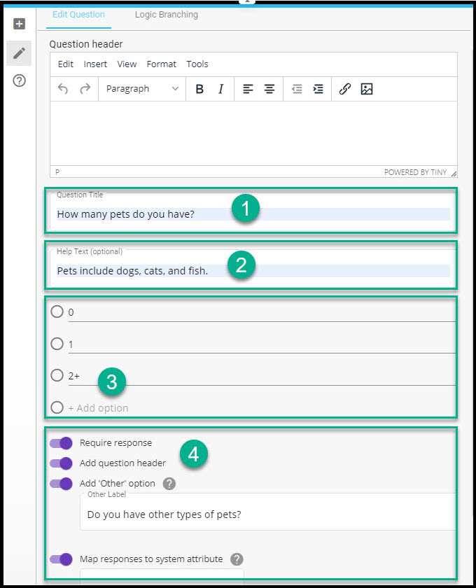
- Enter the main question text in the "Question Title" field
- Enter any help text, if needed, in the "Help Text" field
- Fill in the responses/distractors that you want to appear with the question
- Beneath this main section are three options that you can toggle on if necessary:
- Require response—When toggled on, the end-user will have to answer the question before continuing.
- Add question header—When toggled on, a WYSIWYG editor automatically opens above the "Question Title" field. You can create the question header here (this text will precede the text in the "Question Title" field and can be used to provide more context about the question).
- Add "Other" option—When toggled on, an "Other" option will appear in the list of distractors with the label you choose in the text field that opens when selected.
- System attribute—When toggled on, the end-user's response to this form will be copied to the mapped attribute that you choose from the dropdown. Mapped attribute options include Birthdate, CustomField1, CustomField2, CustomField3, CustomField4, and CustomField5. This option is only applicable to certain question types.
Creating a Number Range Question
The number range question type includes the "Question Title" field and the option for a header and help text like the other question types, but the way you select the distractors is slightly different.
Look at this example of a completed number range question:
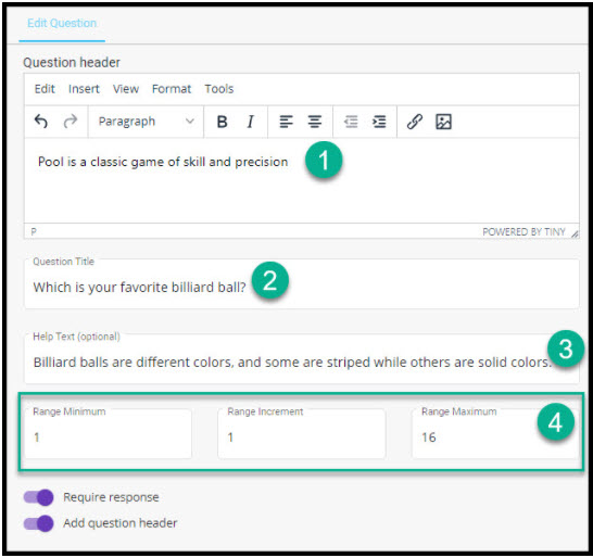
In this example, the question header is toggled on, help text is provided, and the range is set:
- The question will be preceded by the phrase "Pool is a classic game of skill and precision"
- The question for the end-user to answer is "Which is your favorite billiard ball?"
- The help text provides a general description of pool balls for further guidance
- The range is set: the minimum (the first number in the list and the lowest possible answer) is 1, the increment is 1 (this must greater than zero; all options will be listed increasing by the increment you set), and the maximum answer is 16. This means the user will be able to choose a response of 1, 2, 3, 4, etc, up to 16. Had the increment been set as 2 with the minimum set to 1, answers would be listed as: 1, 3, 5, 7, 9, 11, 13, 15.
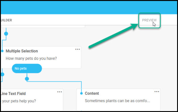
Previewing the Flow
You can see how the flow works by previewing it with the "PREVIEW" button in the upper right of the flow-builder field:
After saving the flow, it can be accessed from the table on the main page where you can edit, clone, preview, view (see the architecture), enable or disable, and delete.
Note: Once you have created a new flow or customized a system flow, you can use the import/export function to easily and quickly copy the flow to multiple portals. This function prevents you from having to recreate and re-customize the same flow. To learn how to do this, see this article.
Was this article helpful?
That’s Great!
Thank you for your feedback
Sorry! We couldn't be helpful
Thank you for your feedback
Feedback sent
We appreciate your effort and will try to fix the article